Fertility Rates Are Tricky

In recent years, demography has become a hot topic in political debate. More and more countries describe their long-term trends as bad, with fewer children being born and populations aging rapidly.
To quantify how bad ‘bad’ is, we use a lot of different metrics. Whenever we analyze the expected number of children per woman, we usually refer to the total fertility rate (TFR). It’s possibly the best proxy we’ve got, but it’s also far trickier than many might assume.
Total fertility rate: what it is (and isn’t)
Before we present the full definition and motivation behind it, it’s better to first explain what TFR is not.
Wrong approach 1: Just take the average number of children per woman?
This idea falls apart very quickly. The number of children our mothers or grandmothers had doesn’t really tell us much about the likelihood that a woman of a certain age would consider having a child now.
To study demographic trends, we need a metric that is not ‘contaminated’ by lifestyles, economic conditions, and decisions from many years ago.
Wrong approach 2: Confusing TFR with Birth Rate
Ok, what about something like the number of births per 1,000 people in the past year? That surely solves the issue of recency mentioned above, right?
This metric is called the (crude) birth rate (BR). Since both BR and TFR are supposed to detect general demographic trends, the two are frequently confused. Regardless of that, there are some serious caveats:
-
If we consider ‘per 1,000 people’ instead of ‘per 1,000 women’, we may expose ourselves to skewed gender ratios. For example, in the United Arab Emirates ~64% of the population are men (2026).
-
Imagine a country where politicians are expected to do something about a low BR. They come up with a brilliant idea: let’s relocate everyone above the age of 60 to the Côte d’Azur or Spain. The BR suddenly improves, even though nothing has changed about how many children women are willing to have.
Wrong approach 3: Confusing TFR with GFR
Ok, what if we focused on women of reproductive age instead? Such a metric is called the general fertility rate (GFR), which usually considers women between the ages of 15 and 49, at least according to the WHO. Unfortunately… problems:
-
One could argue the range is somewhat arbitrary, since a randomly chosen woman aged 48 is, statistically speaking, far less likely to give birth than one aged 28. We could assign some weights to each age group to account for that, but then, GFR would become convoluted and even more arbitrary.
-
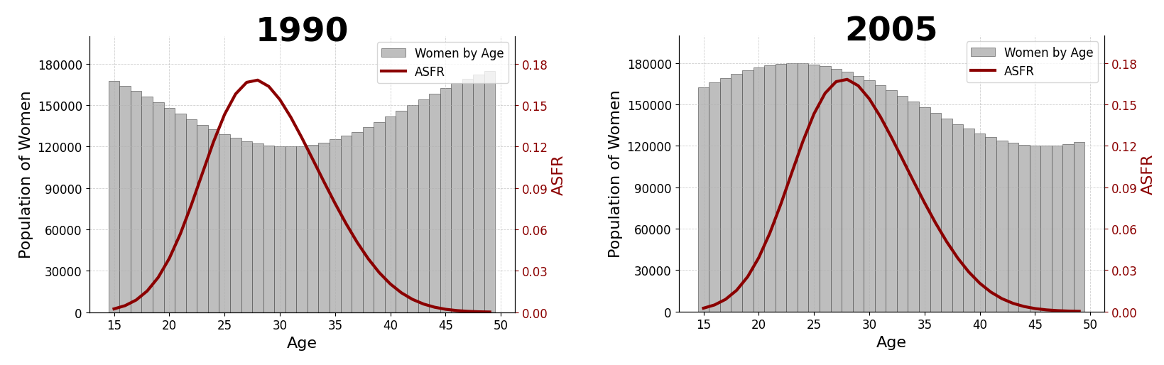
Demographic ebb and flow. Let’s consider the average number of births to women of a particular age in a given country in a given year. This is called ASFR, or Age-Specific Fertility Rate. The idea here is that any significant shift in how childbearing is approached should be reflected in some noticeable changes in ASFR. It turns out, though, that GFR may move even if ASFRs remain constant across all the age groups.
Example. Imagine Country X where the likelihood of a woman of any given age having a child didn’t change at all between 1990 and 2010. For each age group the ASFR remains constant over time. However, the population age structure might change, which will distort GFR.
Actual Definition of TFR
The last wrong approach taught us that we need a metric that won’t change if ASFRs remain fixed. The simplest thing we could do is to simply take the sum of all these values:
\[TFR := \sum_{\text{age}} ASFR(\text{age}).\]Voilà. In the case described by the diagram above we get $TFR = 2.2$.
The key advantage of TFR is that the number is easily interpretable. When we hear that Birth Rate of Country X is 19.4/1000, it’s not intuitively obvious if it’s a lot or not. On the other hand, the TFR of Country X being 2.2 immediately tells us that women are expected to have slightly more than two children on average.
An interpretation of TFR I am quite fond of is the following:
- Imagine a girl born in 2014 (say) who lives through the same year over and over again. Every time she reaches the end of the year, she returns to its beginning and experiences the same conditions. The average total number of children such time-travelling women would have is exactly what the TFR measures.
This metric also has some weaknesses, but among the most popular choices this one is possibly the most robust.
Demographic mythology
In fires of failed experiments and doubts we forged a metric that satisfies several conditions we desire:
1) It is not contaminated by information from the distant past.
2) It can’t be skewed by over- or underrepresentation of certain age cohorts.
3) It’s easy to interpret…
…but alas, even TFR prepared some pitfalls for us. The following three misconceptions are the ones I encountered most often.
Myth 1: If TFR sits below ~2.1, then the population of a country decreases.
The value of 2.1 refers to what’s called the replacement rate. I admit the title of this section is a bit provocative, because it’s not really a myth… in the long run! And it might take decades before we see any ‘long run’. It turns out that, locally, many interesting and counterintuitive scenarios may occur.
Let us begin by stating the obvious:
\[\Delta \text{Population} = \text{Births} - \text{Deaths} + \text{Net Migration}.\]If we forget about the migration effects, then the population grows simply if more people are born than die. As a consequence, if a certain country is young on average, then to get $\Delta \text{Population} > 0$ we don’t even need that many births if the number of deaths stays low.
Example. Consider a country called Imaginationland. Let it satisfy a few conditions:
-
In year 2000 it was occupied only by people of age 40 or younger. In each age group there were exactly 100,000 of both women and men.
-
We have $TFR = 1.0$. The ASFR curve is simplified to two straight lines between the ages of 15 and 45 with a peak at 30.
-
To make the model cleaner, no one before the age of 60 ever dies in Imaginationland.
-
The crucial assumption anyone designing any model loves the most: we assume that no parameter determining the evolution ever changes!
The temporary increase in population despite low TFR is called demographic momentum. As the example above shows, this period may last even a few decades before a country finally reaches the state of demographic freefall.
One could, of course, point out that the scenario I described is artificial and simplified beyond what reality has to offer. However, as the picture below shows, the demographic momentum is actually the norm rather than the exception:
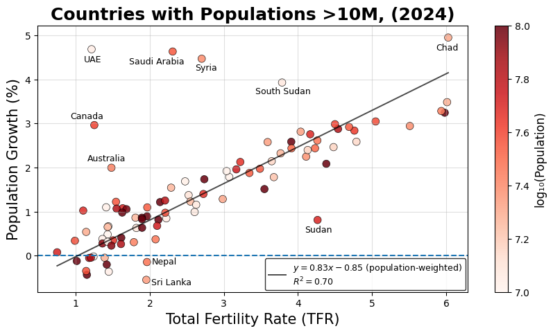
Data source: World Bank.
Myth 2: Replacement rate is above 2.0 mainly because of premature mortality.
Not quite, the main culprit is the sex ratio at birth: more boys than girls are born, and the ratio is usually estimated at around 105/100. To ensure full replacement (1 woman per 1 woman), roughly ~2.05 children must be born per woman on average. Even if no one died before the end of the reproductive age, the sex ratio at birth would still be hardwired by nature itself.
In most high-income countries, a newborn girl is expected to live to at least age 40 with 98-99% probability. In such a case, all one needs is to bump the replacement rate up by another ~0.02-0.03 for good measure.
The last remark here is that in many parts of the world premature mortality (especially infant mortality) still remains a serious issue. In these cases, the true replacement rate can obviously be much higher than 2.1.
Myth 3: Persistently low fertility rates eventually lead to a self-reinforcing aging spiral.
This one is a bit difficult to state cleanly, but there is a fairly common misconception that stems from the following intuition: fewer people are born, which leads to fewer young people working and having children in the future, which in turn leads to even fewer children in the future-future, and so on. A relentless demographic march of the elderly.
The issue is that the number of elderly people also shrinks proportionally over time.
Even if the total population must decrease in the long run, the shape of the population pyramid eventually stabilizes anyway (in the next section I explain why this happens).
Below I demonstrate this effect by simulating how the population pyramid of Poland evolves starting from 2014. Again, we must make two rather brave assumptions:
-
Brave Assumption 1. All the parameters driving the evolution of the system remain unchanged for the next 200 years.
-
Brave Assumption 2. Net migration is zero across all age groups and for both sexes.
The goal is to demonstrate the underlying mechanisms, so we need to make compromises with reality.
Data source: Statistics Poland.
We notice that in 2014, the pyramid has a rather irregular shape, which gradually smooths out over time. The reason is that societies usually shift too quickly for what we call the ‘long term’ to ever truly materialize. It takes almost 100 years of simulation before the convergence becomes clearly visible. Social and economic changes, historical events, technological advancements, etc., simply never allow the system to settle for that long.
Modelling demographic trends
In this section I’ll briefly cover how I generated the simulations discussed in this post. Given some population to study we need the following ingredients:
-
Numbers of men and women for each age group.
-
Survivorship curve for both sexes. From this we can infer the probability of a person surviving the next year depending on age and sex. If by $M_{\text{age},t}$ we denote the number of men of some specific age at time $t$, we could have for example:
-
Sex ratio at birth. I estimated it using the data on Poland of 2014. It turned out that $\mathbf{P}(\text{Girl}) \approx 48.557\%$.
-
ASFR for each age group. Together with the values of $W_{\text{age},t}$ (analogous to $M_{\text{age},t}$ but for women), this gives the formulae for the number of newborns the next year:
For a simple simulation, that’s all! Pushing it by a single year can be summarized on the following graph:
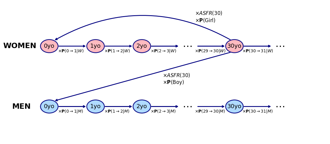
Mathematically speaking, this graph represents a certain flow. Since all edge weights are constant, it behaves similarly to a Markov chain and can therefore be viewed as a linear transformation known as the Leslie matrix. In our simulations we consider men and women aged 0 to 110, so the population vector fed into this matrix has length 220.